Scope of Work
- Logo Design
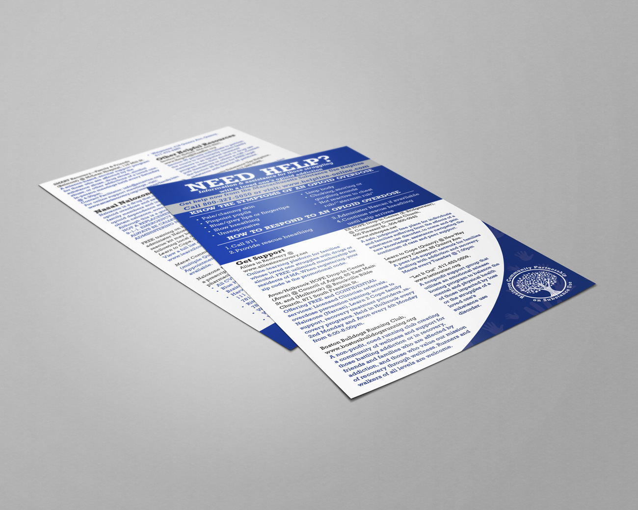
- Integrated Branding Campaign
- Collateral & Booth Design
Overview
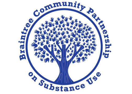
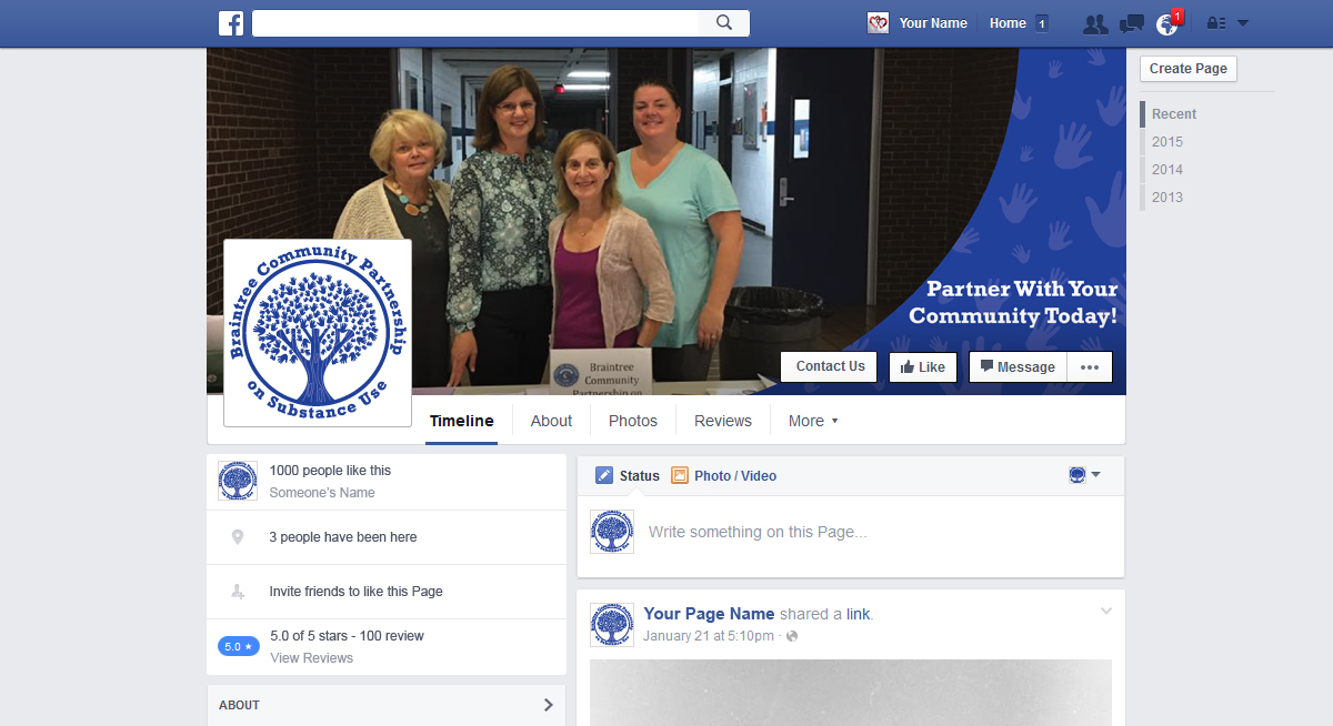
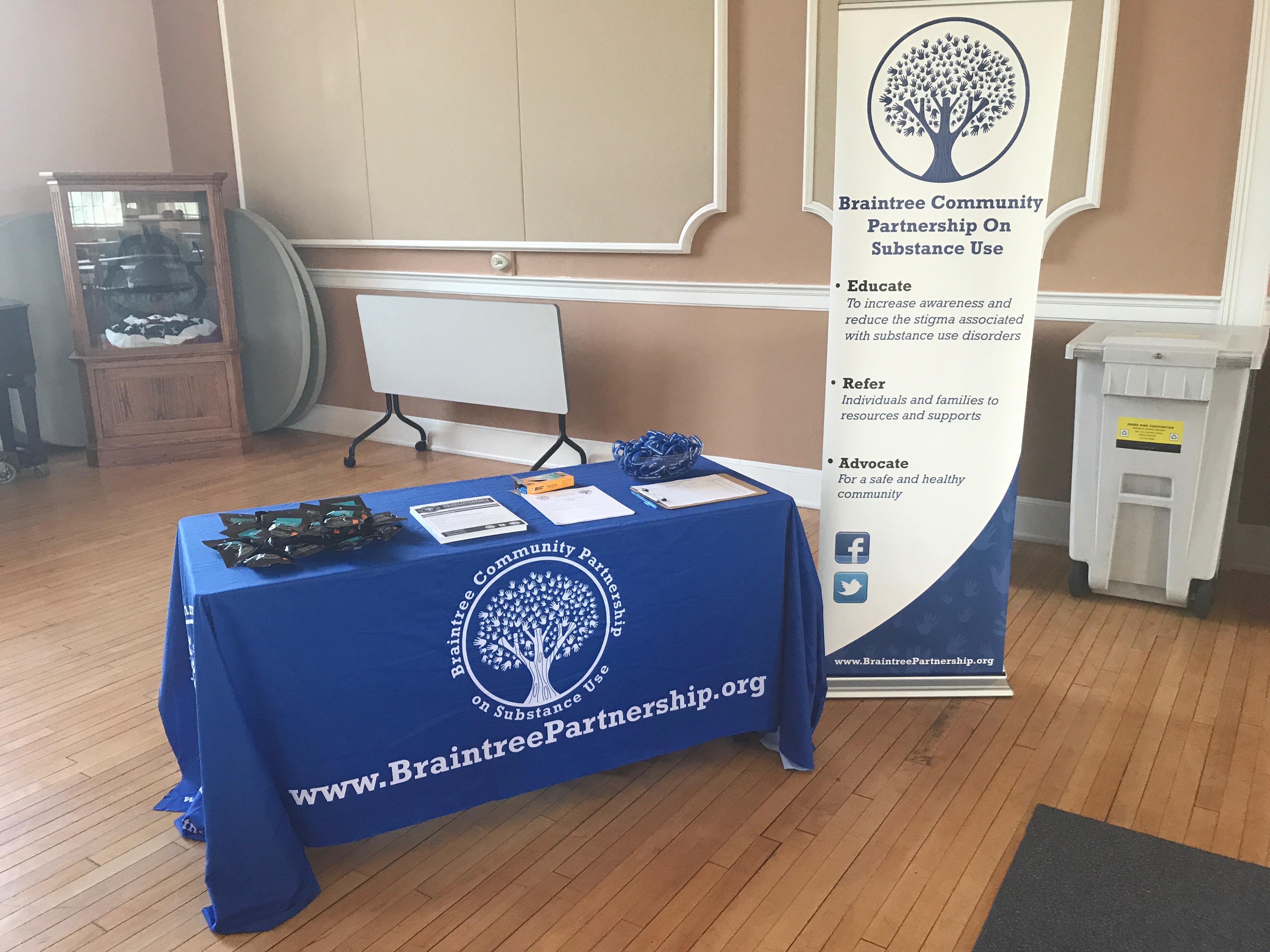
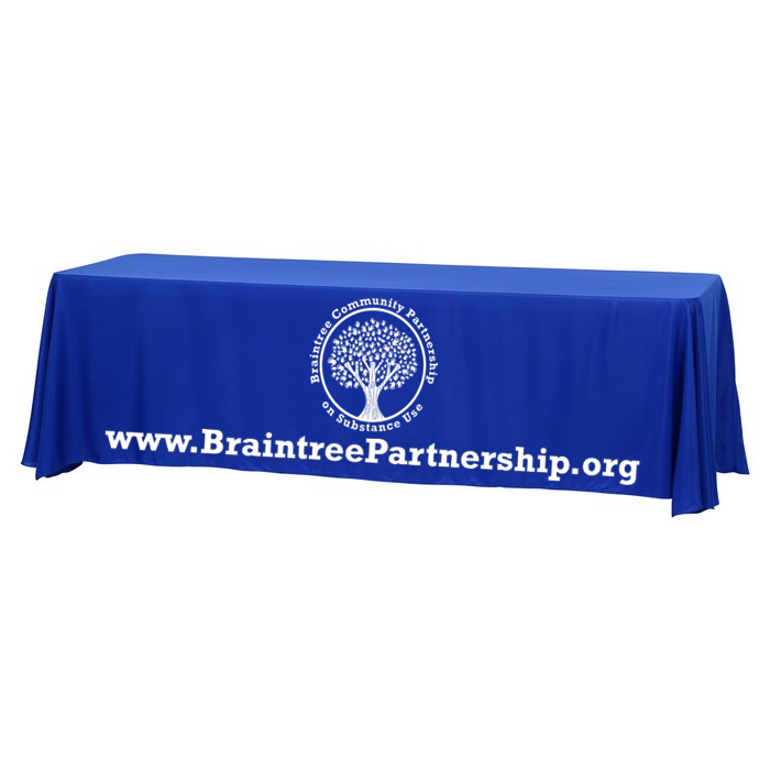
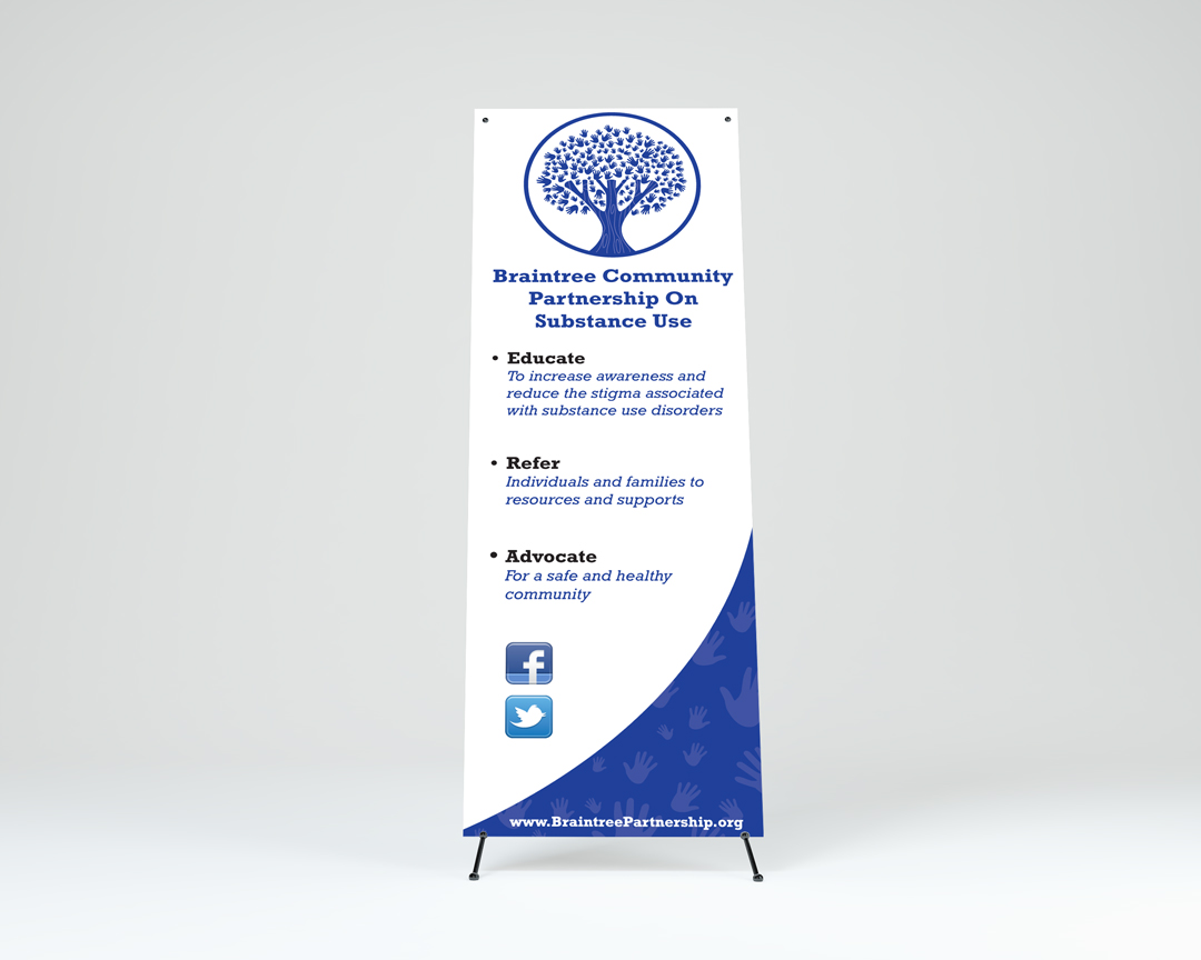
A new task force commissioned by the Mayor of Braintree has been charged with a monumental task, reduce and ultimately eliminate substance use and its devastating effects upon Braintree residents. The Braintree Community Partnership on Substance Use, or The Partnership as it would be nicknamed, was a start up initiative needing a brand image that would become the face of the movement. However, during discovery it was shown that because this was a task force initiated and overseen from the Mayor’s office rather than through a community initiative the brand mark needed to be a unifier. Additionally, the task force has many hands involved and needed support from the various municipal departments as well as town residents. This became one of the main challenges to overcome, create a brand image that wouldn’t appear too lofty and detract community support, but remain solid enough to show that the task force was here to stay and make serious changes.
Strategy & Solution
Some of the requirements of the new logo was that it incorporate the town color of blue, and reflect some aspect of Braintree or its history. After researching current municipal brand marks as well as other substance use logos we opted to use a tree element rather than town seal as the base of the new logo. The town seal, harkening to its revolutionary colonial roots was too harsh for such a sensitive topic. The new logo needed to exude hope, strength and community. By utilizing a tree we eliminated the “Mayor’s task force” stigma thereby inviting community involvement. Furthermore, the tree element would still be cohesive with other municipal brand marks since they used ether the town seal or an iteration of a tree. The logo execution exuded the qualities of hope, strength and community through the solid New England tree with lush and full foliage created through community involvement. We gave The Partnership a slogan that would invite community support as well as lay the foundation for brand recognition, “partner with your community today”.